Use CSS to scroll a thing that is too big for the screen
Created: 2020-05-16
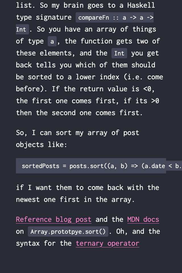
When I first made the code blocks on this site, then went to look at it on mobile, the code ran off the edge of the screen and outside its nice block background. This is UGLY and also pretty hard to read.

Turns out, CSS has a nice way around this - tell the element to add a scroll bar when the thing is too wide. This looks like:
pre {
  overflow-x: auto;
}
The other options are visible (the default one) which makes the content spill out of its box, hidden which truncates it at the boundaries, and scroll which makes there always be a scrollbar if your OS says so. I was originally bitten by the fact that MacOS hides scrollbars, so set it to scroll and then looked at the site on Linux and realised it had a scrollbar regardless of whether one was actually required. auto means one is added only when you actually need it.
I also learned that pre is HTML element which wraps code blocks in the way this site is implemented, and is for putting "preformatted text" in, i.e. text that is meant to be displayed as it is in the HTML file. There's also code for inline code.
MDN docs for overflow-x HTML pre element and code element.